

While tables of numbers have their place, no fan should have to scroll to see their team’s rating. For that reason, I have been spending the past few weeks building a handy visualization called D-I Universe. It’s probably a little different than anything you have seen before, but I think it’s the best way to visualize my ratings and other stats. Not only do you not have to scroll (on some devices) to see the entirety of D-I, but you don’t have to click through to different pages to get some quick insights on teams and conferences.
The typical chart relating offensive and defensive efficiency uses the x-axis for offense and y-axis for defense. This is good enough as far as it goes, but it’s not always obvious which team is the best in terms of net rating on such a chart, and to me, that should be the most obvious thing. For instance here’s what the Big 12 looks like last season.
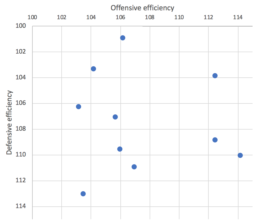
The best teams are towards the top-right, and once you’ve got your bearings, it’s not too much trouble to figure out which team has the best net rating, but its not as easy to figure out who has the second-best net rating. I’m no Edward Tufte, but to me, which team is best is the most important thing in the whole wide world and in D-I Universe, I wanted to make it intuitive to find the best teams.
There are some options one has to make this obvious, but I thought the best way to do this would be to rotate the above plot 45 degrees. The benefit of this is that teams are sorted from best to worst vertically, just like they are in a table of ratings.
Another benefit of that move is that we save some space. Typically, teams with great offenses will at least be pretty good on defense and vice versa (especially when adjusting for schedule strength across the spectrum of Division-I). So in the x-y world, teams tend to congregate along the diagonal. The top-left and bottom-right portions of the plot become unoccupied space. By rotating the axes, that problem is removed. Your eyeballs win with more information in less space.
In D-I Universe, the vertical axis represents AdjEM. In 2018, Villanova is the top-most team and Alabama A&M is the bottom-most team, with everybody in between. But more than that you can see the structure of D-I basketball. You can see why it’s kind of silly to get fired up over the difference between the 25th and 35th best teams in the land. They are nearly indistinguishable. You can see why when the top team loses it might not drop far enough to lose its top spot.
You can see that if Villanova and Virginia made a baby with Villanova’s offense and Virginia’s defense it would be well off the chart, easily the best team of all time. One might conclude that it’s not possible for a team to simultaneously have an offense and defense that good.
In 2002, Duke finished first in both offensive and defensive efficiency, something that hasn’t been duplicated since. But looking at the Universe back then, one can see that while Duke was really good, they weren’t any better relative to the rest of college hoops than Villanova was this season. Their dual efficiency titles were aided by not having any unbalanced teams at the top of the rankings.
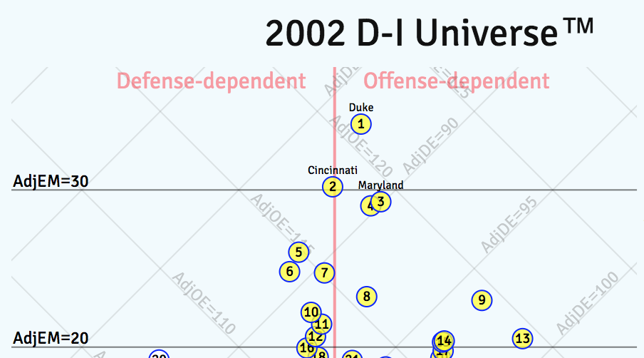
The horizontal axis still has meaning, too. The farther right a team is, the more their offense is better than their defense. It is obvious from the 2018 Universe that the most offensively-imbalanced team was William & Mary since it is the closest to the right edge of the plot. (Pro tip: You can click on a dot to see the team at that location. You can then click on the team name to go its scouting report.)
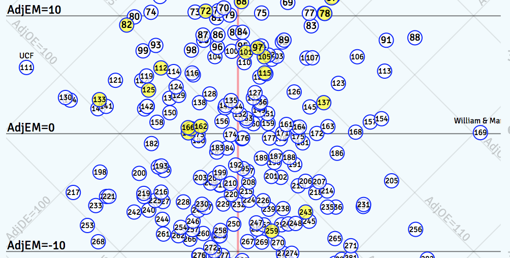
The Tribe’s adjusted offensive rating was 115 or 10 points better than the national average and its adjusted defensive rating was 115, or 10 points worse than the national average. And it’s easy to spot the most defensively imbalanced team. That was UCF, with a defensive rating six points better than the D-I average and an offensive rating 12 points worse than average. This is something that would not be obvious from any tabular representation of the data but now takes less effort than eating a doughnut to discover.
The thing that will require some adjustment is that the best offenses are toward the top-right of the plot and the best defenses are towards the top-left. The underlying diagonal grid lines are your guide here. But also, you can simply select AdjO from the menu to the right of the Universe to the ranks or values for every team. Soon enough it will be second nature to follow the diagonal lines up and to the right to identify the best offenses and up and to the left to find the best defenses.
You might be wondering how to find your team, if it’s not, say, Villanova. Well, simply mouseover (or tap, if on mobile) the conference selectors on the right-hand side. You will get a handy view of each conference. Click on the conference name to lock it in view. Then click on your stat of choice. Click on multiple conferences at a time if you want! There are 496 possible pairs of conferences. If you get through all those, there 4,960 possible combinations of three conferences to explore. That should keep you busy through the offseason.
The visual representation of conferences is especially helpful. You can look at conference standings or even the ratings of teams in a table, but it’s hard to appreciate the stunning parity of teams two through ten in last season’s MVC until you see it in a plot. Check out the lack of competitiveness in the AAC as the league covered the best and worst in D-I last season. Or the depth of the SEC. No Pitt’s or Cal’s to see there. Yes, this information is available through other means but it’s easier to digest now. You will be much smarter in minutes.
Like, I never knew the SoCon had five pretty decent teams and five very much not-so-decent teams last season. Maybe that is something you didn’t need to know. But so what? It took minimal effort to see it. You can mention it at the water cooler or not. Your call.
You can also see how conferences stack up relative to each other. Click on the Big 12, Big Ten, and Pac 12, and it’s apparent that the difference between the Big 12 (best conference) and the Big Ten (fifth-best) was less than the difference between the Big Ten and the Pac-12 (sixth-best).
Ah, but that’s not all. Click through the stats on the right-hand side and you can instantly get an idea of how much 2-point percentage matters to having a good offense. Or how much assist rate matters.Want to find the good offenses with poor assist rates? It should take you approximately 3-4 seconds now. Use the time saved to volunteer at your local hospital.
Many of these observations are things you already kind of knew if you’re into advanced stats. But maybe tables of numbers or correlation coefficients aren’t your thing. This is an easier way to understand some higher-level statistical concepts. Who wants to read some boring piece about how free throw rate is just as important as free throw percentage? A couple of clicks and you can see it for yourself. Fun for the whole family!
This is just the start, though. What insights have you discovered from D-I Universe? Share your ideas in the comments!