

Hey everyone. Now that the beginning-of-the-season rush has settled down, it’s a good time to go over some of the new features on the site.
The short version is:
– New and improved win probability graphs (with FanMatch updates)
– Team records
– Age and position information on the player pages (when available)
– Better position information
Now, the long version:
Win probability graphs
The biggest project of the offseason was upgrading the win probability charts. I hadn’t really touched these since their initial unveiling in the offseason of 2010. For one thing, they look more professional now, almost like you could put them on a real web site.
I also refreshed the algorithm used to calculate the win probabilities which was last updated in 2012. The method is the similar as back then, but I am making use of the results of the tens of thousands of games played since then. One change in methodology is that the initial state is determined by the algorithm itself and not by the percentages given by the ratings. Often, these differences are small.
In addition, each win probability chart contains additional measures to describe the game. These are comeback, excitement, tension, and dominance. The charts now show the ranking in each category among all games played in its respective season. I will briefly explain each of these.
Comeback measures the minimum win probability for the winning team. Please remember that the win probability accounts for the relative strength of the competing teams. Therefore, a team can overcome a low win probability without necessarily overcoming a large deficit on the scoreboard.
Excitement measures the length of the win probability graph assuming both teams are equal. (This is not the same as the plot you see on the graph which accounts for the relative strengths of the teams.) The most exciting game of the season as of this writing was Friday night’s Florida/Gonzaga game. That game was pretty exciting and I think would win a vote of sportswriters so far this season.
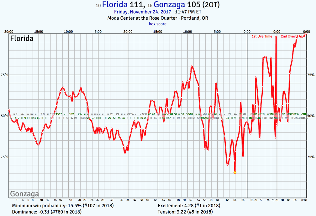
However, the excitement index doesn’t care about the quality of the teams involved. By the end of the season, the most exciting game is as likely to be from the SWAC as it is the SEC.
Excitement is scaled for overtime, so it is measuring something like excitement per minute. Although the most exciting things happen when the game is on the line, so overtime games will usually be quite exciting by this measure. But some overtime games are not that exciting until very late in regulation.
The value listed for excitement is not terribly meaningful. I like to think that a value of one or more means you got your money’s worth and a negative value means you should demand a refund. The entity which sold you the ticket may or may not agree.
Excitement will also have a bias towards high-possession/high-scoring games. For fans of low-possession/low-scoring games, there’s the tension measure.
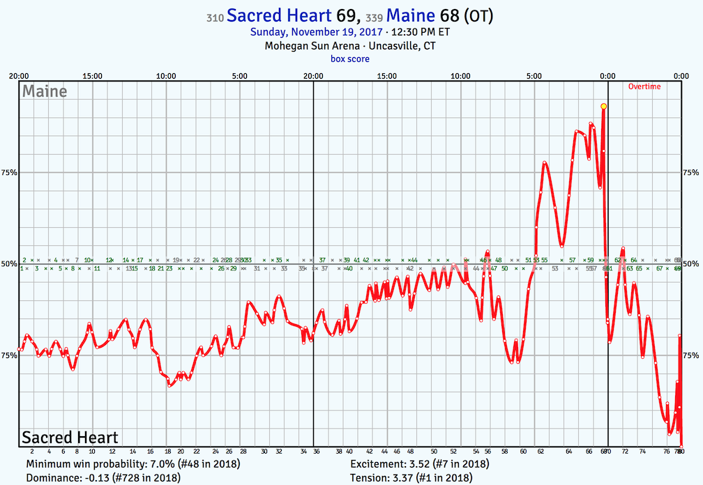
Tension measures the area between the win probability plot (assuming equal teams, so not the one shown) and the 50% line. The most tense game to date was an overtime affair between Sacred Heart and Maine on November 19. Neither team led by more than six over the entire 45 minutes.
Dominance is nearly the inverse of tension. Behind the scenes, I have a model that predicts the final margin at any point in the game assuming the teams are equal. Dominance is measured using the average predicted margin during the game for the winning team. It is not terribly useful, but I needed another score for some symmetry. Build a big lead early and continue to run up the score during the game, win by like 60, and you’ll post a high dominance score. The most dominant game so far was last Thursday’s late-late-late night game between San Diego State and Sacramento State. The Aztecs built a 49-14 halftime lead en route to an 89-52 victory. Go team.
These measures are not meant to settle arguments nor designed to be publication-worthy algorithms. They are simply useful guides to get a feel for how a game was played. If you feel that you witnessed a game more exciting than Florida vs. Gonzaga this season, you probably did. Congrats!
The excitement and comeback measures are also on the FanMatch™ page now with top 100 season ranks noted where appropriate. These are mainly for reference. If you couldn’t stay up to see the Florida/Gonzaga game (no shame in that because it ended at about 2:30 AM ET) then you could have reviewed the FanMatch™ page the next morning and noticed that you missed a crazy game. You can check out the win probability and box score to get an idea of what happened. Then consult the work of local beat writers for quotes and such. You will never miss anything important in college hoops again!1
Team records page
There is a team records page available from the team history page. It lists various game records for each team over the history of the site. Wondering where your team’s recent game ranked all-time in turnover percentage since the 2002 season? Well, if it’s in the top ten best or worst, that page will tell you the answer.

Player page enhancements
Player birthdate and age is now listed on the player page when that information is known. Shown is the player’s age as of January 1st of the appropriate season along with their age relative to their class average. In addition a player’s position for each season is shown provided the player played at least 10% of his team’s available minutes and the season is in the play-by-play era which begins with the 2010 season.
Position identification improvements
The position identification for the depth chart has been improved by leveraging play-by-play data to better identify the point guard that is on the floor. I’m sure you can find teams where the algorithm mis-identifies the point guard, but it is slightly more difficult than before. This has been applied to previous seasons and after a few more games, the 2018 season depth charts will take advantage of play-by-play stats as well.
| ^1 | Assuming timely dissemination of play-by-play data by the home team. |
|---|